Gnuplotting, LaTeXing, and Other Made Up Verbs
Anyone who knows me in person and has seen me do any amount of work in physics knows that my preferred graphing software is Gnuplot.1 This is a piece of command-line plotting software capable of producing nearly every sort of graph imaginable. In fact, it’s results have appeared on this blog before, and can be found in my perfectly reasonable and not at all neurotic rant about exponential growth. It is capable of plotting data and functions in any number of ways. Most importantly, in my mind, Gnuplot scripts can be written which make it easy to produce many similar plots (batch processing).
The only place where I’ve every really had a problem with Gnuplot is when it
comes to including special characters and math in axis labels. Most frustrating of
all, if you are an astronomer, is the near impossibility of getting Gnuplot to
produce the little symbol used for the sun (\(\odot\)). All of this forces
scientists to go to great length in order to make the labels on their plots look
vaguely decent. This is opposed to some other graphing programs, such as
Veusz, which are capable of using parts of the
well-known \(\LaTeX\) markup language to produce this sort of output. Thus,
a label such as \(4\pi r^{2}~\[R_{\odot}\]\) can be produced with syntax as simple
as 4\pi r^{2}~[M_{\odot}]. While one of the formats that Gnuplot can output
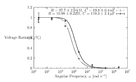
is LaTeX, the quality of the resulting plot is terrible. Just look at the
figure below (a plot of some data and curves fit to that data from a recent
lab report).
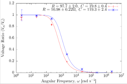
However, there is another choice of output: the cairolatex terminal. This terminal, which is related to the pdfcairo terminal, actually produces two files. One of these is a PDF or EPS file with the axes, data, and functions of the plot. The other is a LaTeX file which contains the information necessary to place labels on said plot. The actual plot in this case is of far better quality, while labels are still in LaTeX and can thus contain math, special characters, etc. Producing the same plot as above using this terminal, we get a much better result.
The main disadvantage of this approach is that the LaTeX file must be compiled before you can see the actual result. However, with the right settings and a call to a LaTeX compiler at the end of your script, this problem is easily surmountable. In order to make this easy, I’ve written myself a little template Gnuplot script, with these features built in. Simply change the name of the output file (without including any extension) on line nine and add the various setting and plot commands that you need.
comments powered by Disqus